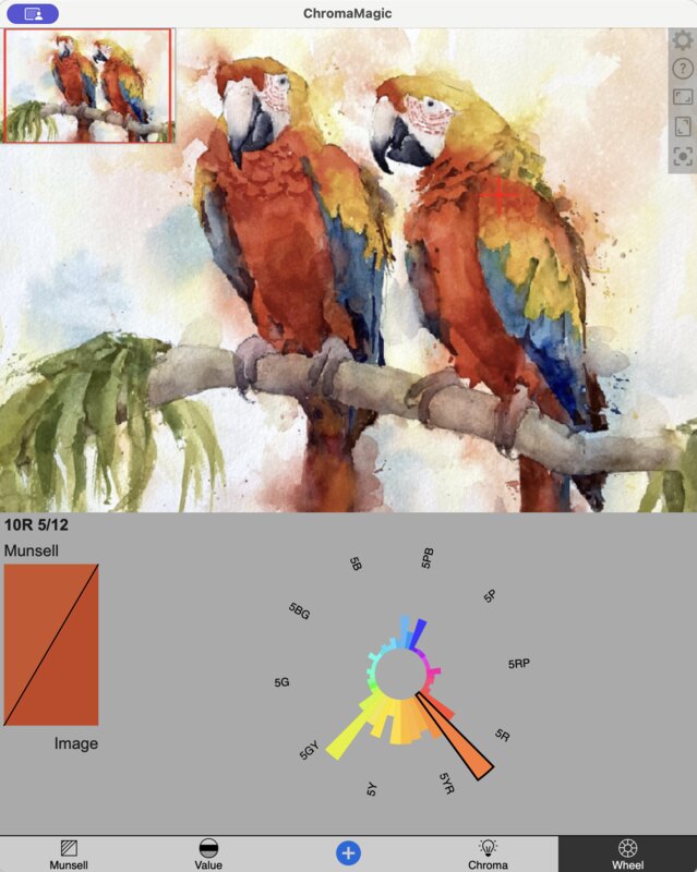
 icon on the top right to recenter the image on the selected color. Very useful before zooming or if your selected color goes off screen.
 icon will fit the image to the height of the image canvas. The
  will fit the image to the width of the screen. I often use this after zooming in on a region to quickly get back to see the full image.
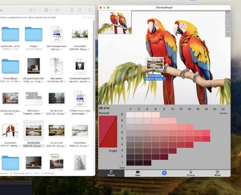
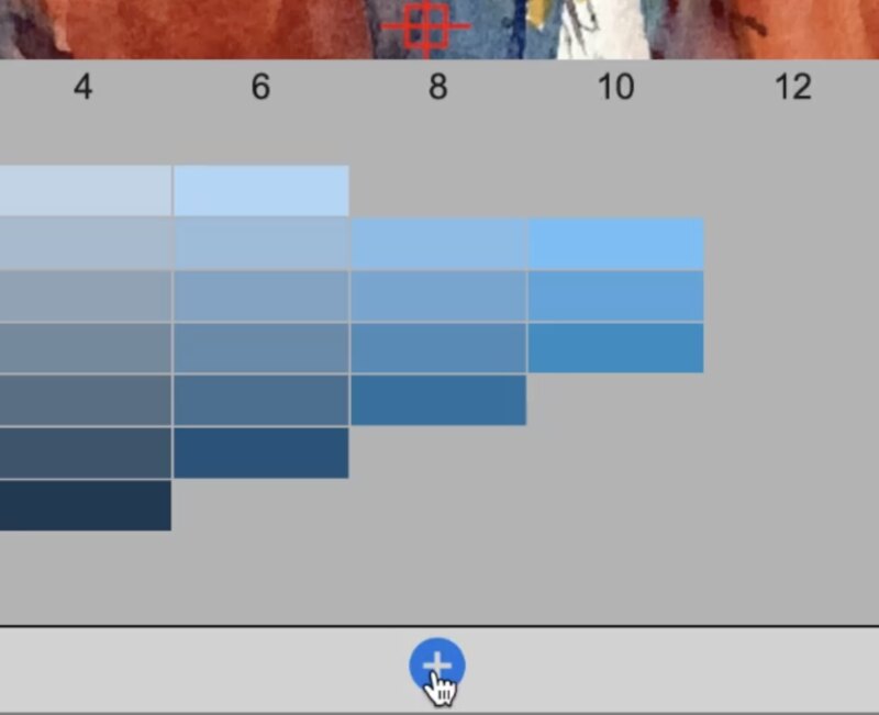
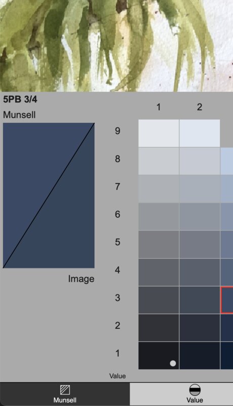
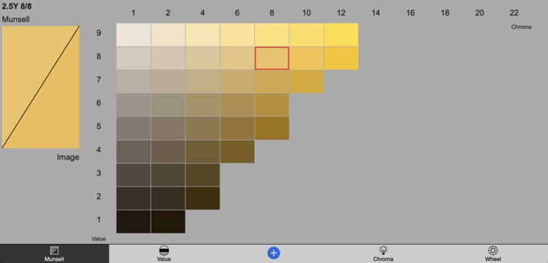
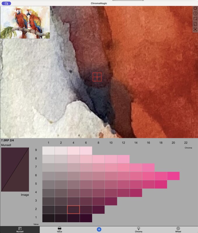
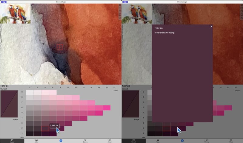
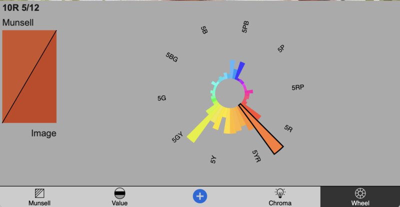
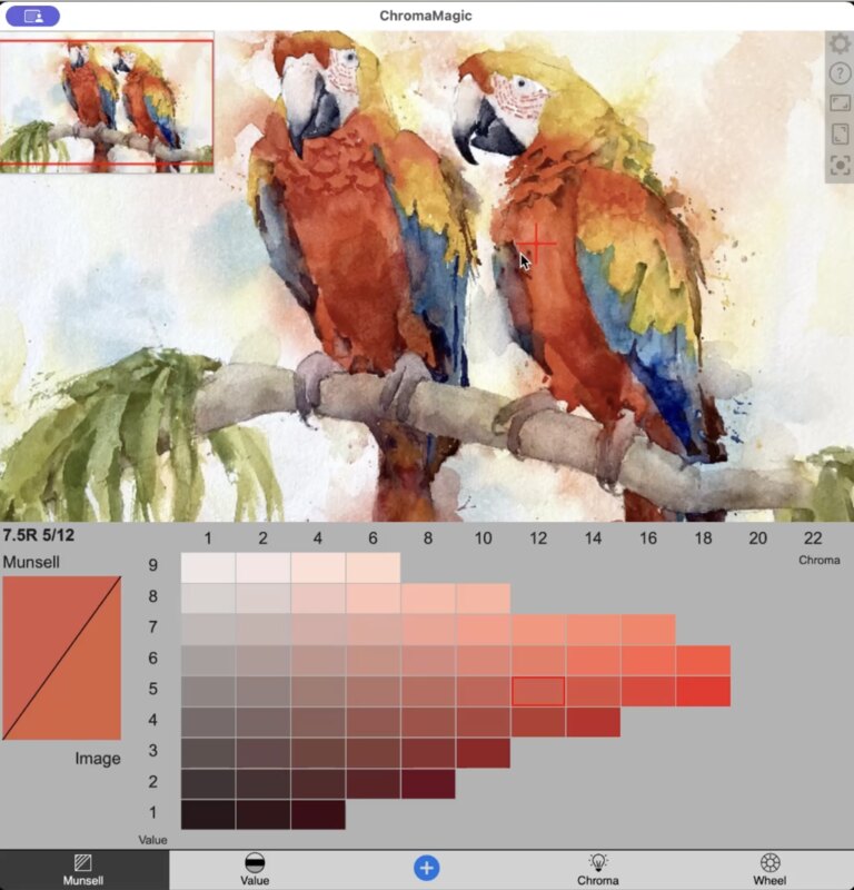
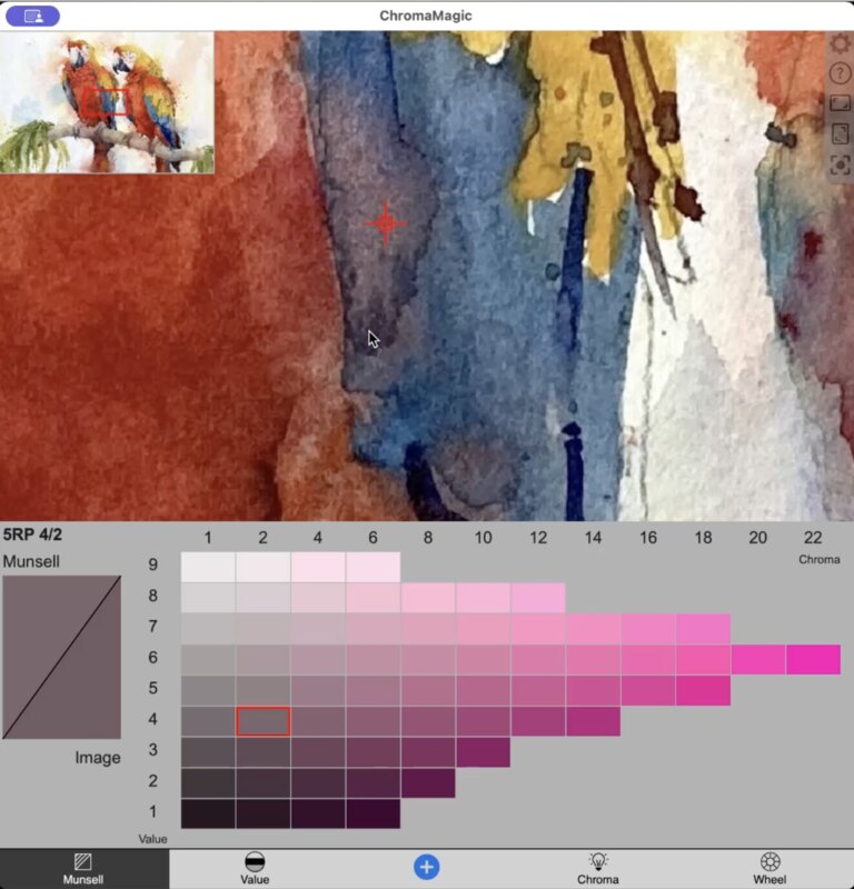
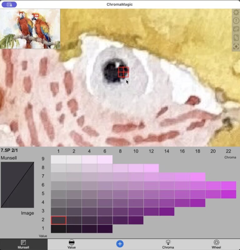
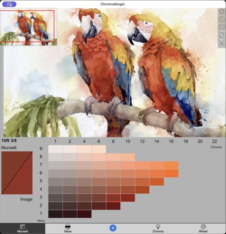
Each color (or hue in Munsell terms) has a color chart. The chips are arranged with value vertically and chroma horizontally. Dark values are at the bottom and light values at the top. And similarly low chroma (or grayed out/unsaturated colors) on the left and high chroma, saturated colors on the right.